Plotting and Exploring Results
Look at a 40-year stack, page through it year by year, click a pixel to see its history and what LandTrendr made of it, and put the result on a satellite image, with one function: zeit.plot.
Dataset, a pixel's seriespip install zeit-cdts[plot]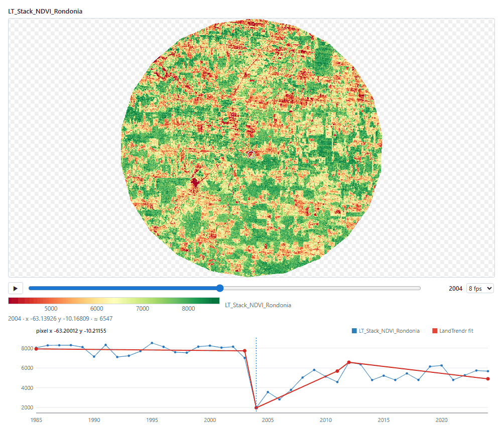
Why a viewer of its own
Dense time series are hard to look at with the usual tools. A matplotlib figure redraws every frame in Python (about 8 frames per second in a notebook), and a GPU widget that renders on the kernel still makes one round trip per frame. zeit.plot sends each frame to the browser once, as one byte per cell, and the browser's GPU colours it through a lookup table. After that, paging through time does not involve Python at all. It runs at the display's refresh rate (144 frames per second in our tests), and keeps working while another cell runs.
The cube is never read at full resolution as a whole: frames are read at about 800 cells on the longest side (the 40-year stack below is 12.5 MB at that size, loaded in a fraction of a second), and the viewer fetches finer cells only for the window you zoom into. On a dense lazy cube (240 dates of 2048 × 2048 cells in Zarr), the first frame shows in about a second and all 240 dates are in the browser within 9 seconds.
Step by step
1. Install and load
import zeit

ndvi = zeit.load_raster("LT_Stack_NDVI_Rondonia.tif")
print(ndvi.dims, ndvi.shape)     # ('time', 'y', 'x') (40, 1671, 1686), years 1985-2024
This is the same stack as in the LandTrendr tutorial: annual NDVI × 10,000 in Int16, EPSG:4326. load_raster names the cube after the file (LT_Stack_NDVI_Rondonia), which matters below: the name tells zeit.plot this is a vegetation index.
2. A grid of years
A static figure is the quickest look, and what goes into a report:
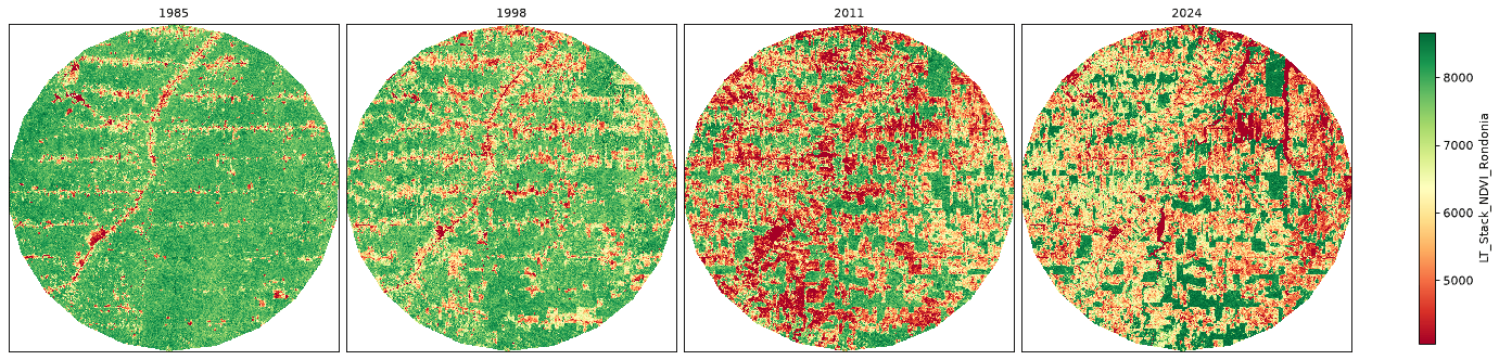
Nothing was configured. zeit.plot saw a vegetation index and used RdYlGn (green is high NDVI), set the colour limits from a sample instead of the whole cube, and treated 0 in this integer stack as NoData, as Earth Engine exports mean it. Every choice can be overridden:
time= takes labels ("2015"), years (2015), dates (the nearest frame), indices (0, -1), a list of these, or "all". Without it a static plot shows up to 12 frames spread over the series.
3. Page through time
In a notebook (JupyterLab, Notebook 7, VS Code or Colab), leave static= out:
The cell's output is the viewer: the first frame appears at once, and the rest arrive in the background, from the current frame outwards (the bar under the map shows the progress). Then:
| To | Do |
|---|---|
| Play or pause | Space, or ▶. The selector next to the slider sets the speed (1 to 60 fps). |
| Step | ← and →, Home and End, or drag the slider |
| Pan, zoom, reset | Drag, mouse wheel, double-click. Paused and zoomed in, the visible window is fetched again at a finer resolution. |
| Read a value | Hover: the year, the coordinates and the NDVI under the cursor appear below the map |
Click the viewer first so that it gets the keyboard. The value under the cursor is read back from the colour index, so it is approximate (≈, within 1/254 of the colour range).
4. Run LandTrendr and click a pixel
Calibrating a change-detection algorithm means looking at many pixels: is this vertex where the forest was cleared? Did it miss the regrowth? Pass the result as fit=, then click a pixel:
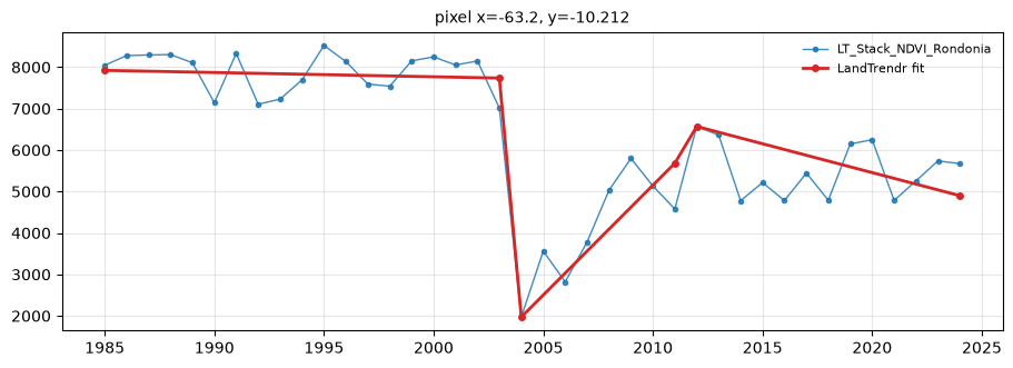
The pixel's full series appears below the map, with LandTrendr's segments and vertices over it (the figure at the top of this page). A dotted line marks the frame shown, and clicking the chart jumps to that year, so you can go from a break in the series to the map on that date and back. The result is matched to the cube by coordinates, so a fit computed on a crop works too: pixels outside it just have no overlay.
Other results work the same way:
fit= |
What you see on the pixel's series |
|---|---|
zeit.landtrendr(ndvi) |
The segments, with the vertices |
zeit.extract_events(lt) |
The event kept for the pixel, as a shaded span |
zeit.ccdc(cube) |
The harmonic model of each segment and its break |
zeit.bfast_monitor(cube, ...) |
The break, and where monitoring starts |
zeit.bfast_lite(cube), zeit.bfast(cube) |
The breaks |
zeit.mann_kendall(ndvi) |
The Theil-Sen trend line |
For a report, ask for one pixel as a figure: pixel= takes (x, y) in the data's coordinates, here longitude and latitude:
5. A loss-year map over satellite imagery
Results are Datasets, and zeit.plot shows them like any other data. zeit.plot(loss) opens the viewer with a selector for yod, magnitude, duration… Here we keep the confident events, as in the LandTrendr tutorial, and put the year of loss on a satellite basemap with an area of interest outlined:
from shapely.geometry import box

loss = zeit.extract_events(lt, min_magnitude=2000)
confident = (loss.yod > 1985) & (loss.dsnr >= 3)
loss_year = (loss.yod + 1).where(confident, 0).astype("uint16").rename("loss_year")

aoi = box(-63.30, -10.30, -63.15, -10.15)          # or a file: vector="aoi.gpkg"
zeit.plot(loss_year, basemap="satellite", vector=aoi, title="First year of NDVI loss")
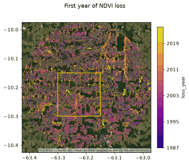
static=True). loss_year is a year map, so it gets a sequential palette with whole years on the colour bar; pixels without an event (0) are transparent, so the imagery shows through.A few things happened on their own:
- Years. A map named like
yod,yearor*_year, or with integers between 1800 and 2200, is coloured as years. - No event, no colour.
0is NoData for an integer map without one (nodata="auto"), so only the events are drawn. - Any CRS. The data stays in its own CRS. The viewer places the web map's tiles under it without reprojecting the frames; a static plot downloads the tiles (cached in
~/.cache/zeit/tiles) and warps them to the data's CRS. - Opacity. Over a basemap the data is drawn at 80 % opacity;
opacity=changes it, and the viewer has a slider.
basemap= also takes "osm", "light" and "dark" (grey canvases), "topo", an xyzservices provider or name, or any {z}/{x}/{y} URL. vector= takes a vector file, a GeoDataFrame, a shapely geometry or a list of them, reprojected to the data's CRS; vector_color= sets their colour.
6. Save a figure
save= writes the figure (PNG, PDF, SVG… at 150 dpi) and returns it:
zeit.plot(loss_year, basemap="satellite", vector=aoi, save="loss_year.png")
zeit.plot(ndvi, time="all", ncols=8, save="ndvi_1985_2024.pdf")
save= implies a static plot. For full control, the figure is an ordinary matplotlib Figure, and ax= draws a map into your own layout:
import matplotlib.pyplot as plt

fig, (a, b) = plt.subplots(1, 2, figsize=(10, 4))
zeit.plot(ndvi, time="1985", ax=a, static=True)
zeit.plot(ndvi, time="2024", ax=b, static=True)
fig.savefig("before_after.png", dpi=200)
7. Outside the notebook
The same call works in a script or a terminal. There, zeit.plot opens the viewer in its own window: a native window if pywebview is installed, otherwise a browser tab.
# look.py
import zeit

ndvi = zeit.load_raster("LT_Stack_NDVI_Rondonia.tif")
lt = zeit.landtrendr(ndvi)
zeit.plot(ndvi, fit=lt)      # opens a window; the script waits until you close it
print("done")
python look.py blocks on zeit.plot until the window is closed, like plt.show(). In an interactive interpreter (python -i, IPython in a terminal) the call returns a Window at once and the window stays up, so you can keep working:
>>> w = zeit.plot(ndvi)
>>> w.url                    # the page, if you want to open it in another browser
'http://127.0.0.1:52113/Qm3n.../'
>>> w.close()
The page is served from 127.0.0.1 under a random token, so other users of the machine and other web pages cannot read the data. Where there is no screen (a server without a display, CI, tests) zeit.plot returns a figure instead, and ZEIT_PLOT=static in the environment does the same anywhere outside a notebook.
Tips
- Large cubes. The viewer reads frames at about 800 cells on the longest side (
max_size=) and keeps up to about 400 MB of them in the browser, so a cube larger than memory is fine, especially a lazy one (load_raster(..., chunks="auto")). Each frame is read when needed. - Remote notebooks (JupyterHub, Colab). The preload is one transfer, compressed by default (
compress=True); after it, playback uses neither the network nor the kernel. - Other dimensions. Every dimension other than
yandxis a frame axis:zeit.plot(lt)pages through LandTrendr's vertices,zeit.plot(ccdc_result, var="coefs")through CCDC's segments, bands and coefficients (labelled1_blue_a0, …). - Categories. Integer maps with at most 32 values (classes,
n_vertices) get one colour per value and a legend. Name them withclasses={1: "forest", 2: ("pasture", "#e8c170")}. - One pixel's series. A 1-D
DataArrayorpandas.Seriesis plotted as a line:zeit.plot(ndvi.sel(x=-63.2, y=-10.21, method="nearest")).
See the API reference for every parameter and the full colour rules.